


Akzo Nobel recently introduced a convenient new product that facilitates the work of designers and architects — the Sikkens Color Sensor color scanner. This is a stylish compact device in the form of a small polyhedron, which in a matter of seconds determines the color of any object or surface, for example, a wall, a furniture facade or even a piece of fabric, and instantly finds an analogue in the collection of Akzo Nobel shades, as well as the closest ones according to the RAL and NCS systems. Simple and convenient to use, it will select the shade without fail, and the accuracy of hitting will be 98-99%. At the same time, the device does not need to be calibrated.
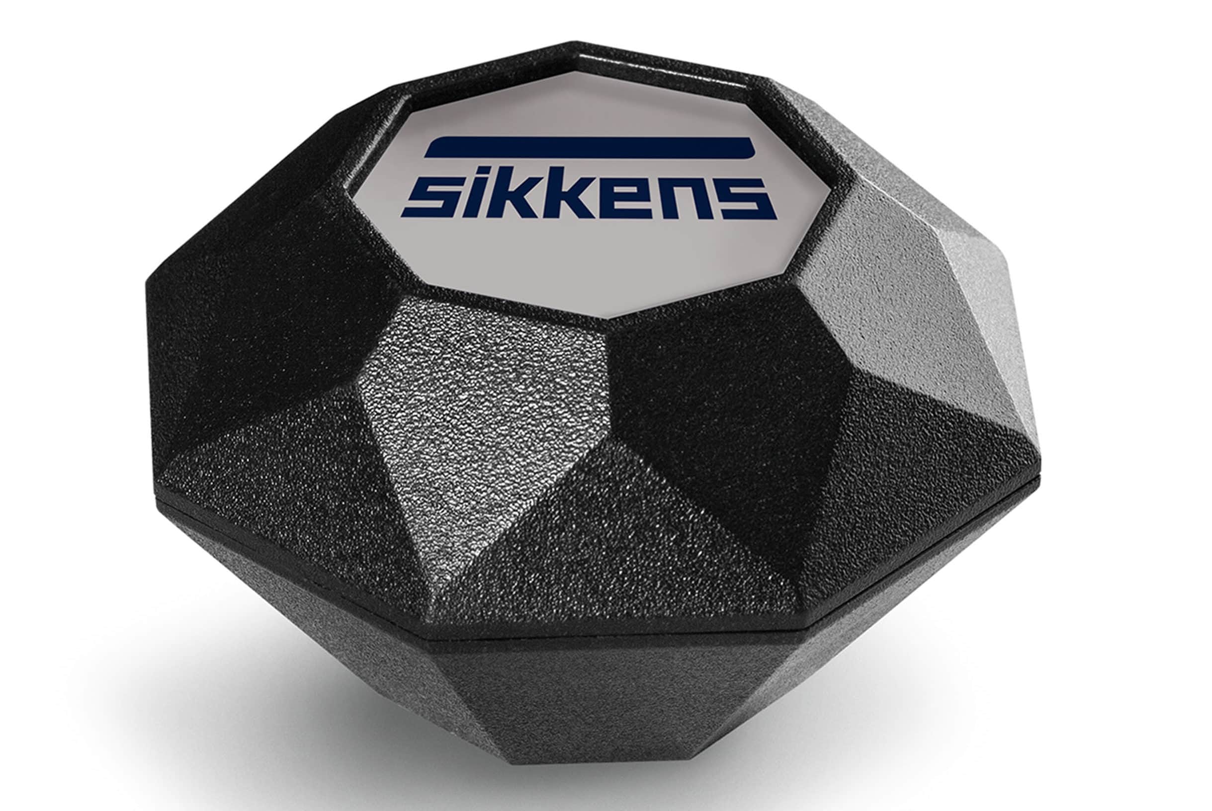
This is a compact item in the shape of a polyhedron that easily fits in a briefcase or bag
Sikkens Color Sensor will come in handy, even if you need to paint only a plinth, cornice or air conditioner in the tone of the wall: it will eliminate the need to study color fans and maps, and immediately offer an accurate option. Another important area of ego application is restoration projects. It is no secret that with such works it often turns out that archival documents on the object have been lost or only black and white photographs, faded sketches that give a weak idea of the original palette remain, but if there are samples of paint, the surviving fragments are covered, then the scanner will instantly restore the authentic color gamut and will help in accurately recreating the historical form.
The novelty from Sadolin determines the color of any object or surface in seconds

Everything works simply: you need to charge the device, then download the application to your mobile phone and start scanning - just put it to the surface. The received data is displayed on the screen of a smartphone or tablet. A free mobile application for iOS and Android will allow you to save and group shades.
We asked architects who are already working with the new color selection tool about how the Sikkens Color Sensor behaves in practice.
Elena Logvynets
Loft bureau
Elena Logvynets
"A color scanner for an interior designer is a universal pocket tool, the second most important after roulette. Given that the design is based not only on plans and volumes, but also on textures and colors, color is important in the future interior.
If an artist needs only a step to achieve the necessary range, then users need at least a color palette rich in shades and a very high-quality product. When we were looking for paint and color for the walls of our office in 2000, it was only thanks to the master artist from Johnstone's that we created the perfect gray shade. Then it was the most expensive product on the market, but its high quality still guarantees color for more than 20 years.
One can recall the period of "breaking patterns" in the pavilions of the annual Milan furniture salons. Attempts to recreate the exact color ended in complete failure. And the Italians continued to supply cans with "branded" patented paints to their objects abroad. Personally, the first breakthrough for me was the color palettes of English paints brought by our foreign customers. A close familiarity with the rich nuances of a complex color scheme drove progress in the interior sphere, however, not without difficulties. The question "guess the composition" still came in second place after choosing a color. Is it now worth exaggerating the appearance of a professional scanner for designer practice? The result in one touch, there is no barrier to curiosity, experiments in a fraction of a second.
"Integrity is the way to create an ideal space for decades"
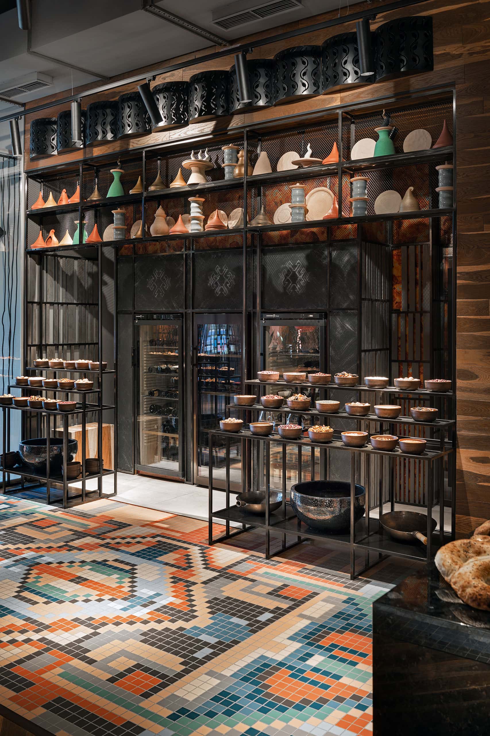
Restaurant "Ugly", fragment of the entrance area, design — Loft buro, Kyiv. "Carpet" made of ceramic tiles is a modern representation of traditional Azerbaijani ornaments. Photo: Andrey Avdeenko
However, for customers, patterns remain relevant in any case, because the texture of the base has a decisive effect. For them, it is always important to choose the color density when the shade is already selected.
What can be said about personal experiments? I wanted to use the scanner on everything where there is paint. The correctness of the result depends on the material of the object or its surface. For example, the skin has a loose texture, so the scanner will give a slightly distorted color.
All Loft buro interiors are unique, and the chain from idea to realization is based on the image of the future object. Sometimes we ourselves create a fashionable palette an hour or two before its widespread distribution. I am sure that it is not the color in the interior that should be fashionable, but the general concept. Integrity is the way to create an ideal space for decades.
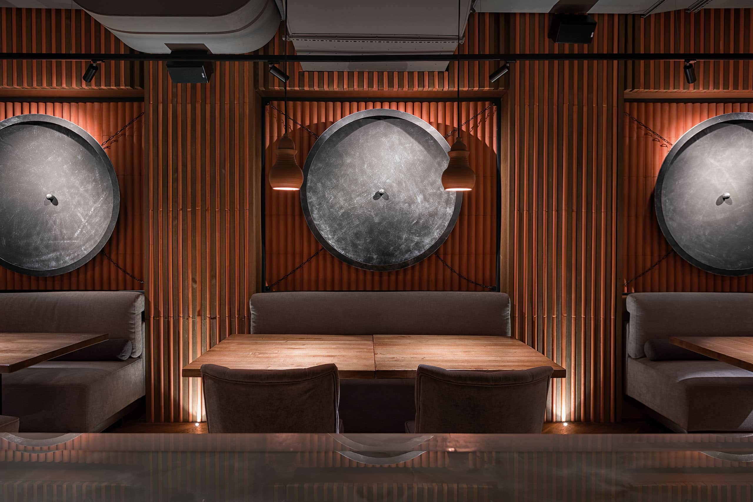
Some decorative elements of the interior of "Uglei" repeat the shape of traditional pots for pilaf. Design — Loft buro. Photo: Andrey Avdeenko
"The result in one touch, there is no barrier to curiosity, experiments in a fraction of a second"

The interior of the "Ugly" restaurant is a contemporary interpretation of the cultural codes of the Caucasus, Libya, and Turkmenistan. Design — Loft buro. Photo: Andrey Avdeenko
Objects of art in the interior require special attention. In my opinion, valuable exhibits require a neutral environment and professional lighting. A poster, interior painting or an art object as an accent in a specific space can serve as part of a general concept, and in this case the second principle of color selection works.
In conclusion, I want to say that now I feel safe. If you need to repaint the Loft buro office in the same (and only that!) color, I always have the Sikkens Color Sensor magic wand with me. And Sadolin will help fulfill the mission."
Mykola Gulyk
Baraban architecture crew
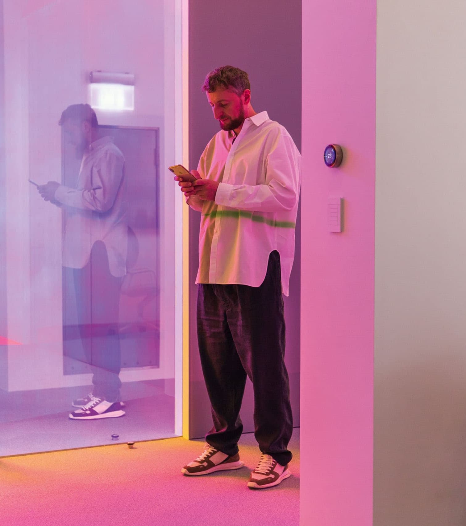
Mykola Gulyk
"We use the color scanner quite often. Mainly for choosing the color of wall paint, ceiling or products based on selected materials (furniture decoration, curtain material, etc.), as well as for checking the color matching of wall paint and products on the object. In my opinion, the appearance of such a device did not so much affect the approach to design as added an additional opportunity to monitor the performance of work. I note that the accuracy of color selection is quite high. True, there were moments when the scanner could not pick up the color, but this is more due to the limitations of the RAL palette itself.
"The appearance of such a device added an additional opportunity to control the performance of work"
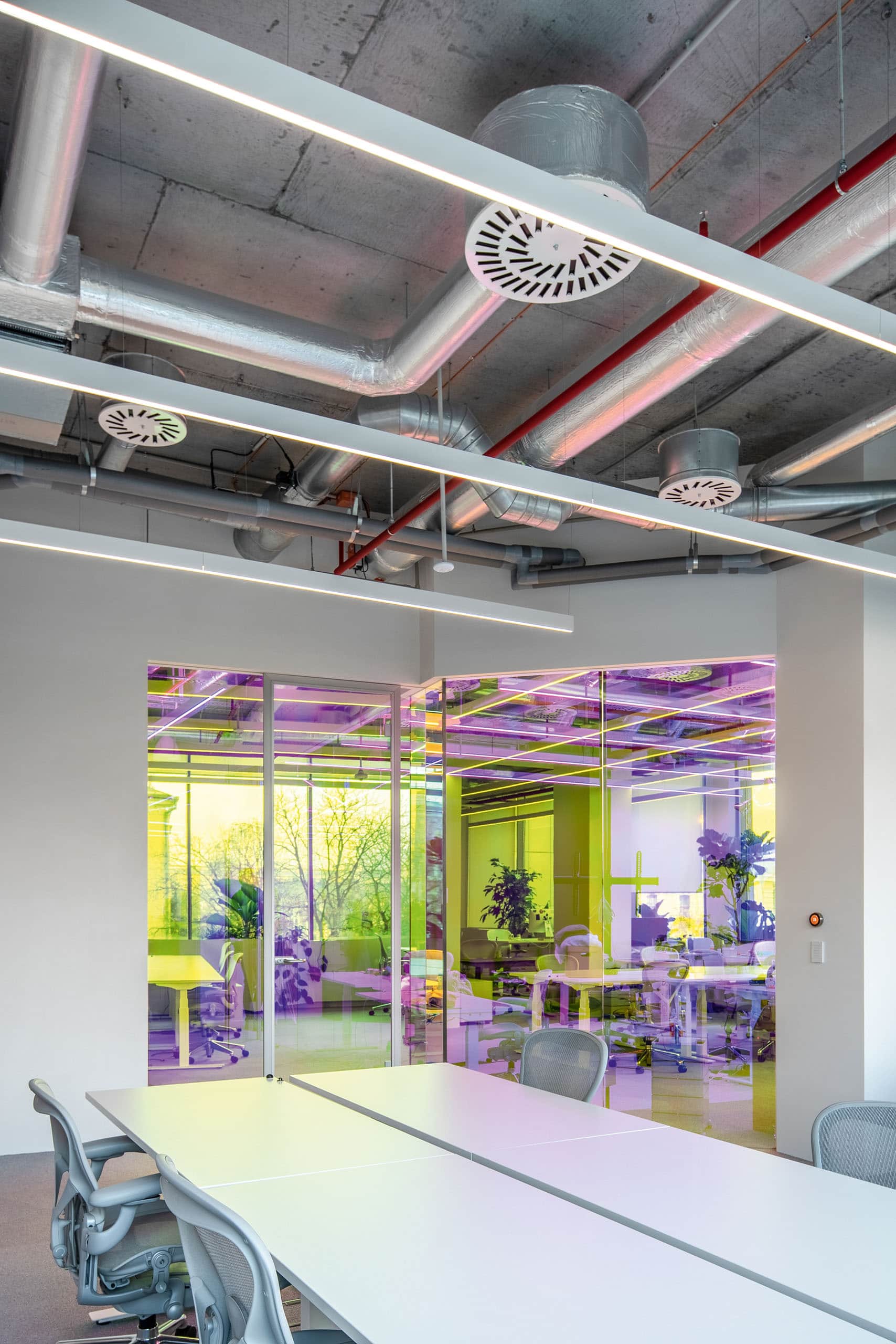
MPS office for a Ukrainian IT company, project of the studio of Mykola Hulyk baraban architecture crew, Kyiv. Photo: Andrey Bezuglov
The choice of palette depends on many factors, including personal preferences of customers, and it is not always related to fashion or trends. Depending on the purpose, the interior may have different color solutions. And it is our task to choose it correctly.
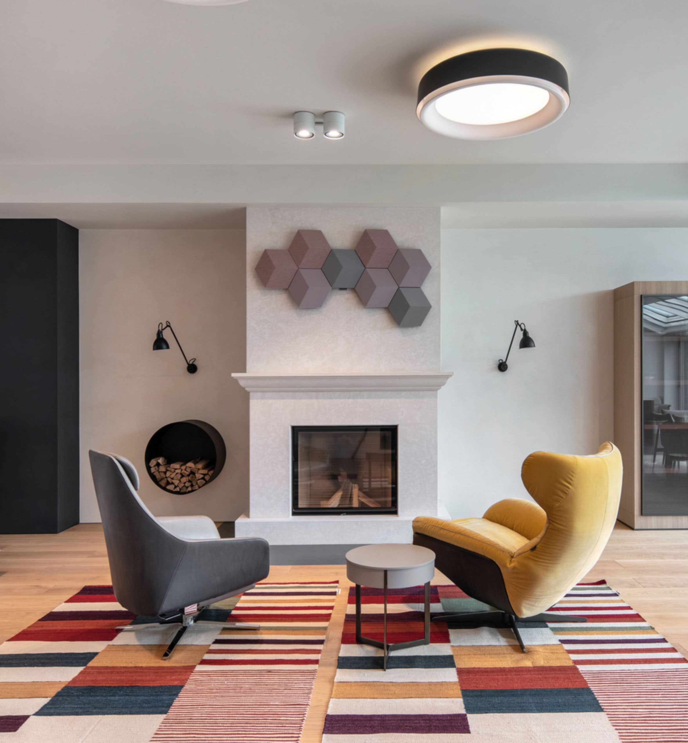
Project R, recreation area in the living room, design studio baraban architecture crew, Kyiv. Photo: Andrey Bezuglov
"The choice of palette depends on many factors and is not always related to fashion or trends"

Photo: Andrey Bezuglov
Unfortunately, our period of using the Sikkens Color Sensor is not so long, so we haven't had any interesting cases yet. Customers do not know about this option, we do not take egos to meetings. It is still difficult to answer in what aspects it is still possible to apply it. It is necessary to use it longer to say something specific."
Yury Zimenko
Design Studio Yuriy Zimenko

Yury Zimenko
"With the appearance of this gadget, I immediately started using it and realized that it simplifies work and makes one of the processes simple and interesting. Convenient, fast! I will not say that the approaches to interior design have changed, but they have definitely become better. I started making friends with color a long time ago, so both color in the interior and the right light are extremely important to me. As for the customers, they first of all remain satisfied with the exact match of the shade. And the scanner itself arouses both interest and emotion in them. For example, when clients came to the facility with children, I risked being left without a gadget.
"Both the color in the interior and the right light in it are extremely important to me"
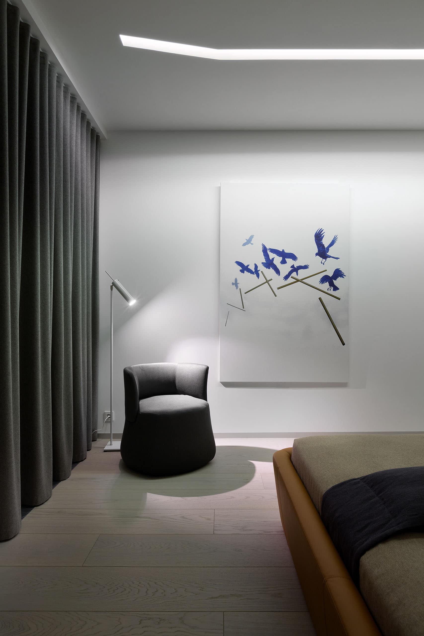
Bedroom fragment, RiverStone residential complex, Design Studio Yuriy Zimenko, Kyiv. Photo: Andrey Avdeenko
At first, by the way, I got into the habit of scanning everything in a row, you know how to "shazamit" any melody you hear, but then you get used to it and use the device as intended and only when necessary. If we talk about the accuracy of correspondence, then for the RAL and NCS systems it is 98%. Anticipating the question about popular palettes now, I will say that terracotta and mustard are especially popular.
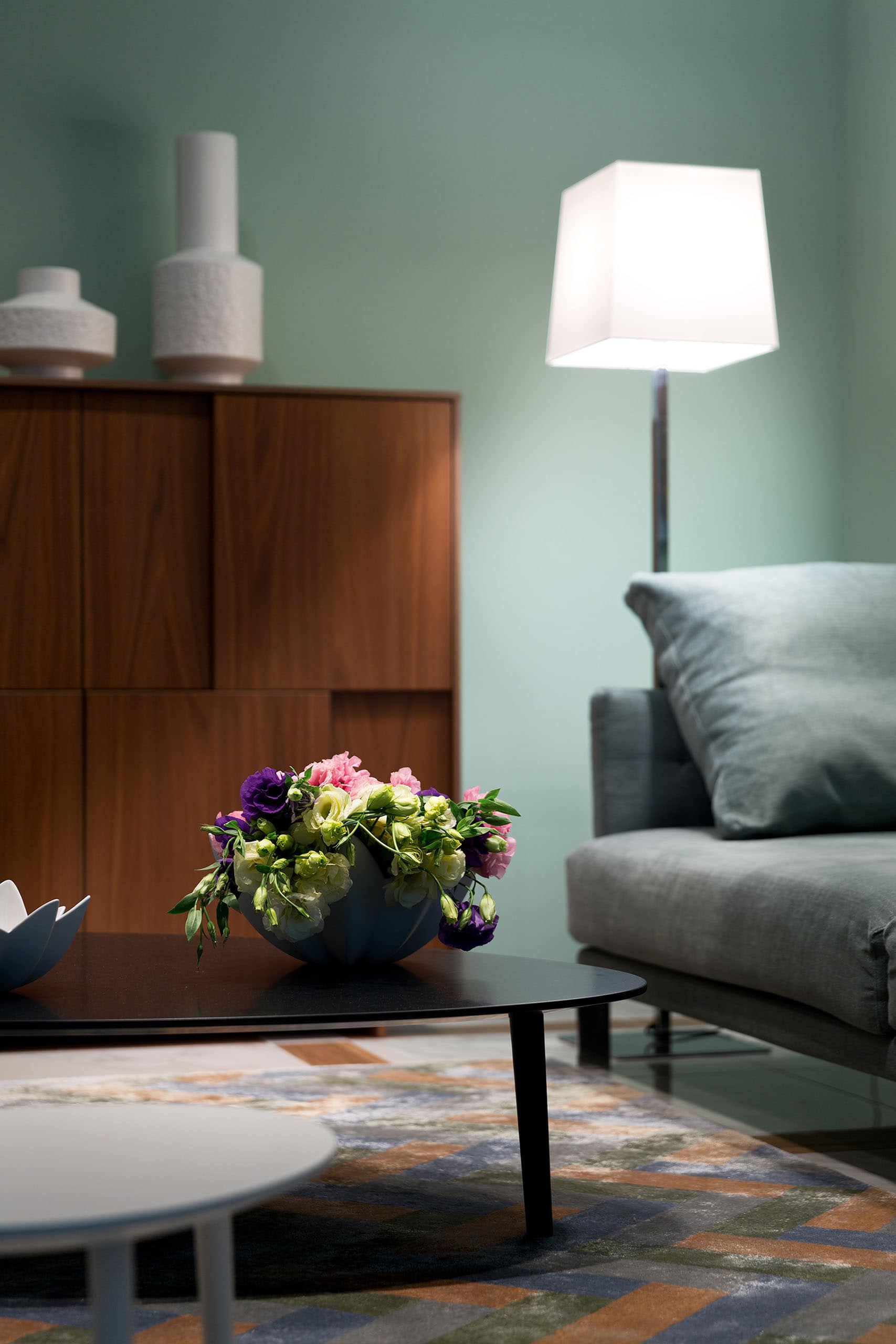
Part of the living room, Busov Hill residential complex, Novopecherskie lipki. Photo: Andrey Avdeenko
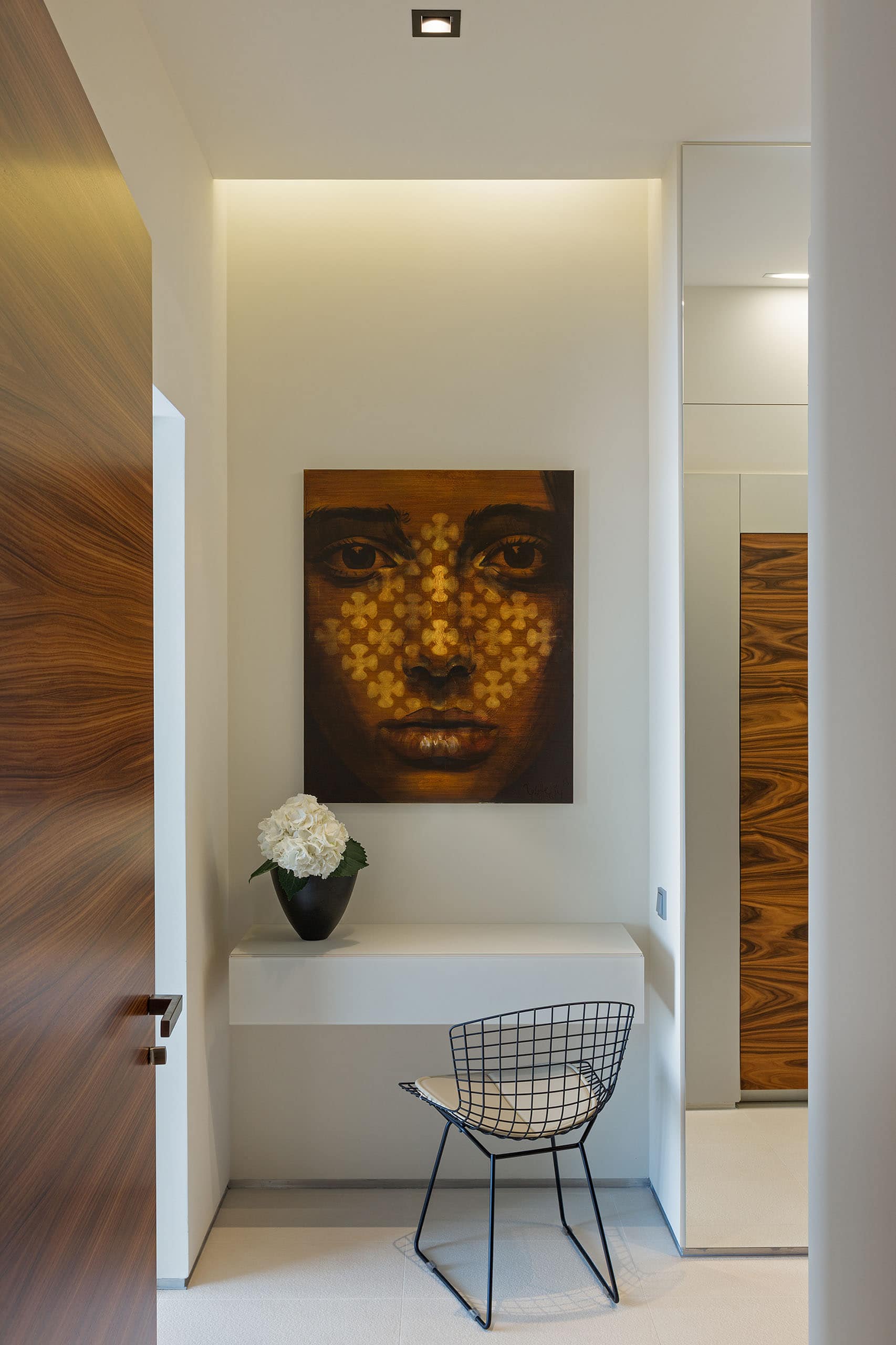
Part of the living room, Busov Hill residential complex, Novopecherskie lipki. Photo: Andrey Avdeenko
"If we talk about the palette, then terracotta and mustard are particularly popular"

Photo: Andrey Avdeenko
Since the interior is often supplemented with some details, accents, objects of art, then, of course, the device can be applied to them as well in order to choose a winning palette. The new scanner undoubtedly opens up more possibilities and speeds up the work process.
Victoria Alekhina
Architect

Victoria Alekhina
"I use the color scanner infrequently, because I don't have to deal with the choice of shades every day. The Sikkens Color Sensor is a compact, lightweight item that fits in a bag. It optimizes the work in the sense that it allows you to determine the color at any time when necessary. I used to take a color palette with me, but now I can use a scanner and open a palette with the right shade right in the office. In terms of determining color, I have a pretty accurate eye. The scanner is useful, for example, when you need to quickly determine the color of a material, for example, a tile, and choose a shade of paint for it. Yes, it makes work easier in the literal sense, too: you don't have to carry voluminous crayons, color cards, etc. Plus it helps to "remember" the choice. As for its accuracy, it is 4,5 out of 5, and sometimes 5 out of 5, that is, almost exactly. Much depends on the material of the surface being scanned. For example, if it is glossy, then you need to understand that compared to the absolute, the shade will differ due to reflections.
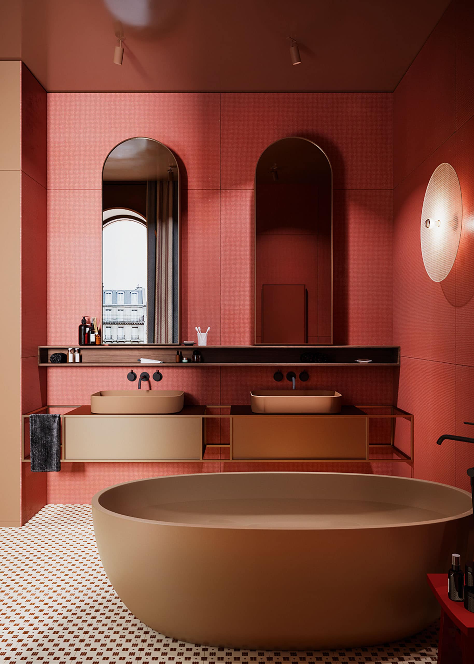
Bathroom fragment, Flat in Red project, designed by Victoria Alekhina, Kyiv
"The designer must work with his eyes, choose not a similar, but a winning color"
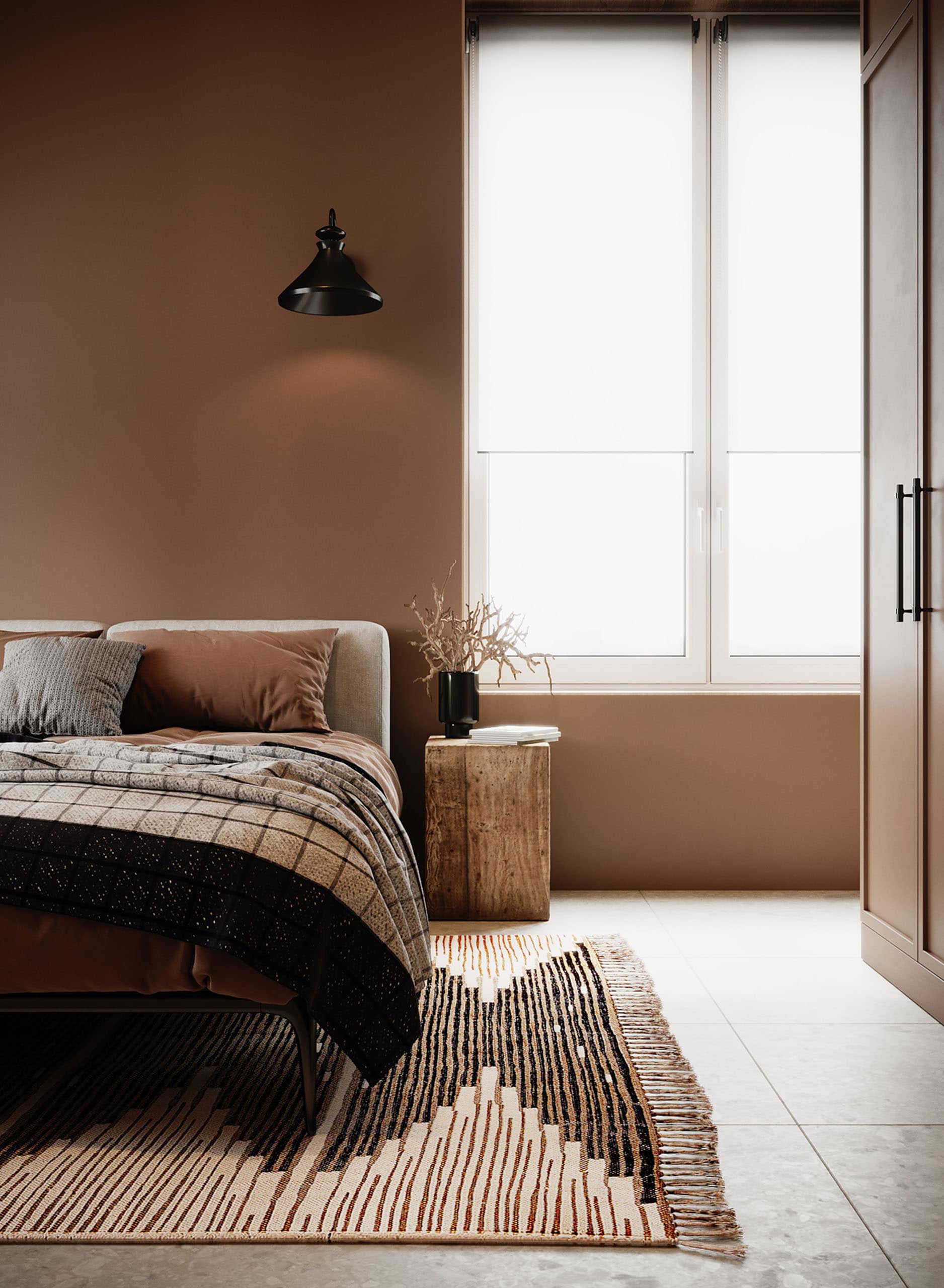
Bedroom part, Apartment Basa project, interior design — Viktoria Alekhina, Kyiv
I think chasing fashion or betting on the "color of the year" is rash. Fashion is a seasonal, fleeting phenomenon, but the interior is still created for a long time. I will look with interest to see what the Panton Color Institute has chosen once again, but no more. And designers, as a rule, anticipate trends and already work with color even before its official announcement.
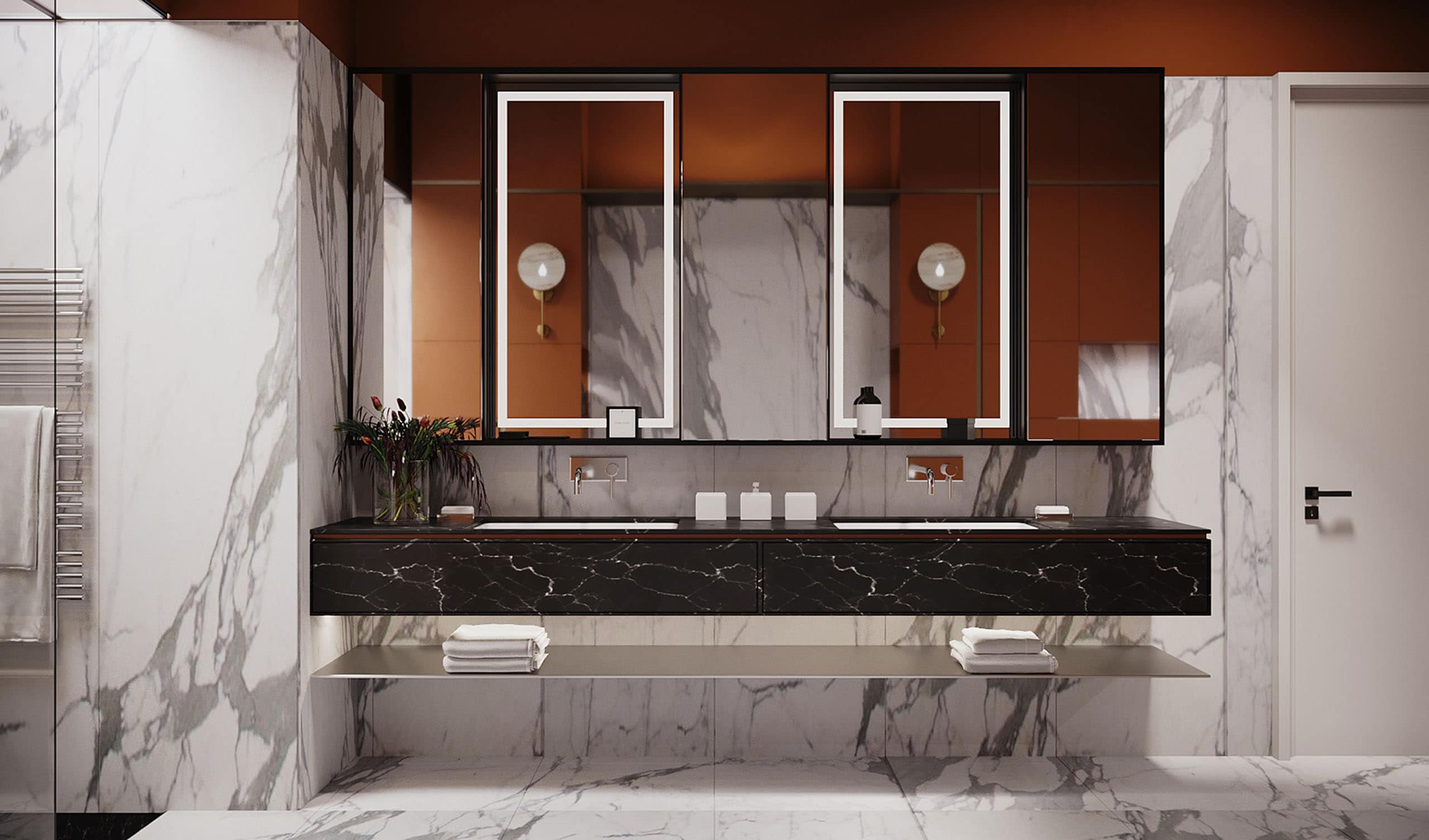
Main bathroom, project 11TH Apartment, design — Viktoria Alekhina, Kyiv
In addition, the interior palette consists of many components, including taking into account the purpose and lighting of the premises, the customer's personal preferences, and finally. Objects of art, accent items are also necessary, but they appear when the concept of the interior is already developed, so it is a mistake to build a color solution on them. The designer must work with his eyes, choose not a similar, but a winning color. And the Sikkens Color Sensor helps to determine at the right moment the color with which you will work later, gives an additional point of reference."


